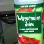
I bought some Watermelon Juice from Trader Joes today and I noticed something funny. The font for the juice log was totally different from my Fiji Water. The Trader Joes watermelon juice was all wiggly and wraggly and it looked like it was made by either a very thoughtful artist or else a child who had been deprived of neural-transmitters for several days.
On the other hand the Fiji water logo looked all civilized and prim and proper. It made me think of tranquility and relaxation and even confidence with each sip. But the watermelon juice was saying to me, “HEY it’s time to surf the net and PARTY!!! Let’s see what we can see, baby!”
This begs the question, “What is the decision-making process for these fonts and logos.” Wanna know what I think is going on? Demographics!!! They target people who like watermelon juice I bet as sassy people who are a little bit on the wild-side. That’s my guess.
Watch the video and decide for yourself!
-Tyler
