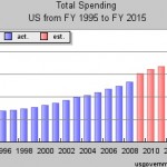
Have you ever wondered how much money the government has been spent on things like education, the military, and pensions? Well I found a cool website that shows that information in both bar graph and line format. It also shows tables which shows the percent of GDP that is spent on the specific areas. The website is called usgovernmentspending.com and it is a great resource. This would be a great website to use if you needed information for your economics class or social commentary paper. I foresee that I will definitely make use of this website for future articles. The website was created and executed by Mr. Christopher Chantrill. I think this is a website that everyone who is a US Citizen needs to visit at least once in his/her lives. The reason why is that you get to see first hand what kind of money is being spent on what. I was disappointed to see that we only spend about 1% of our total GDP on education. I just think that education should be a bigger priority than that. Because if we don’t have an educated population, then what’s the point of being here? When I looked up how much of a percentage of our GDP was being spent on our national debt I was appalled. The number was so high that I don’t even feel comfortable talking about it on overidon.com it really is that bad. If you want to see the chart that I looked at then click on this link and look it up for yourself.
OK. If this kind of money is being spent on the national debt, then what are the people who get that money spending it on? Because we are seriously talking about trillions of dollars here. I’m starting to feel paranoid so I don’t want to talk about this anymore.
So yeah, graphs are good. I just looked up a graph that was on the government spending on transportation It seems that we spend about .6% of our GDP for 2009. That’s an interesting number. According to the chart that number is estimated to jump by quite a bit as 2010 rolls out.
I was looking at the defense spending charts and those were interesting. They really weren’t as high as I expected. They were much higher than education and transportation spending. But that makes sense. In any simulation that I’ve run that deals with civilizations. If you don’t spend good money on your military you end up with hostile forces opening up shop in your capital city. It really is as simple as that.
Overall usgovernmentspending.com is a MUST-HAVE resource to add to your bookmark collection if you care at all about what’s going on in the USA.
-Tyler
